The Rockhurst University logo represents us at the highest level and is a key component to our brand. It is the primary identification for our visual identification and should be used consistently in all communications.
The Rockhurst University logo is the preferred logo for all communications. It should be used in almost every instance of communication, as it is the brand “hero.” As a small university, the brand recognition of Rockhurst University supersedes that of individual colleges, schools or departments. In limited instances, it may make sense to instead use an approved unit logo for a University college, school or department.
NOTE: The Rockhurst University logo should never be recreated or typeset. Only official logo files should be used in communications.
To request official logo files, email marketing@rockhurst.edu.
Primary Usage
Our standard logo consists of two elements – the Circle R icon and the “Rockhurst University” word mark.
The primary color option for our logo is Rockhurst Blue – it should be used on lighter backgrounds and images to maintain legibility. The Circle R icon should always include a white background, so that no other color or photograph is shown behind the circle.
The following secondary options are available:
- A reversed-out logo (white) may be used on Rockhurst Blue colored backgrounds.
- A black version may be used for black-and-white and grayscale materials.
- A two-color version with the standard blue Circle R icon and white letters may be used at marketing’s discretion when placing the logo on a darker color.

Size:
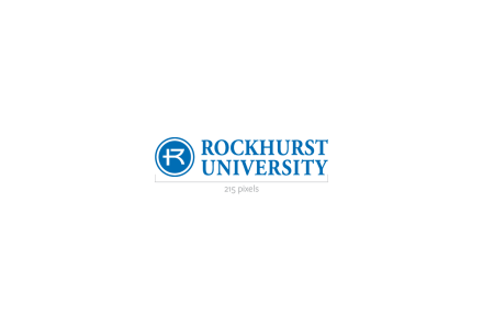
To maintain legibility, the logo should never be reproduced at widths smaller than 1.5 inches (for print) or 215 pixels (for digital).
Clear Space:
Clear space should be maintained around the logo for legibility and prominence. Use the letter “R” as a measuring tool to ensure that enough clear space is left surrounding the logo.

Avoid altering the logo in any of the ways depicted below, including:
- condensing, stretching or changing the dimensions
- altering the placement or scale of logo elements
- cropping; adding or changing colors
- skewing or distorting
- rotating
- adding elements or text
- adding drop shadows, boxes or other effects
- altering the typeface
- scanning or copying from the web
- adding taglines

Alternate Version
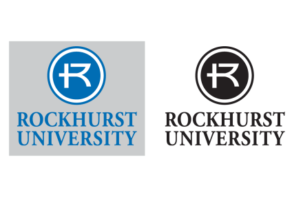
The primary logo should be used in most cases, but in certain instances, space may dictate that a vertical logo should be used.
The vertical logo is available in the primary color (Rockhurst Blue) as well as the secondary options listed below:
- A reversed-out logo (white) may be used on Rockhurst Blue colored backgrounds.
- A black version may be used for black-and-white and grayscale materials.
- A two-color version with the standard blue Circle R icon and white letters may be used at marketing’s discretion when placing the logo on a darker color.
The same sizing, clear space and improper usage rules for the primary logo apply for the alternate version.

The Circle R Icon
The Circle R icon is a symbol that may be used to reinforce the brand. It may be used independently from the primary logo in materials produced by University Marketing.
The full University logo should be present on all materials in addition to the Circle R, unless the audience is already familiar with the University. If space does not allow for the full University logo – for example, in a small digital ad – the name “Rockhurst University” in full should appear somewhere on the communication.
The primary color option for the Circle R icon is Rockhurst Blue always used with a white background. A reversed-out (white) option with transparent background may be used on Rockhurst Blue backgrounds. A black option with white background may be used in black-and-white and grayscale scenarios.
When used as a graphic element, the Circle R has more freedom in design options. It may be used as a watermark, in a pattern, behind images, in rotation and with a bleed as long as the shape remains recognizable. Remember that the Circle R icon may only be used as a graphic element by University Marketing.
The Circle R icon should never be used as an “R” without the circle or as the letter R as part of a word. It should also never be paired with any words (outside the official University logo wordmark).

Unit Logos
In limited instances, such as apparel or communications for student recruitment, a unit logo may be used. To ensure the strength of the Rockhurst brand is not diluted, University unit logos are restricted to academic colleges, as well as approved administrative offices that demonstrate a specific need.
The Rockhurst University logo is the preferred logo for all communications. It should be used in almost every instance of communication, as it is the brand “hero.” As a small university, the brand recognition of Rockhurst University supersedes that of individual colleges, schools or departments.
Academic departments should not receive their own unit logo, but rather place the academic name independent of the University, college or school logo. University Marketing can assist in placement for apparel and merchandise requests.
Official unit logos are only to be created and distributed by University Marketing. Contact marketing@rockhurst.edu to request a unit logo.
Avoid the following:
- Placing a unit logo on texture, photo or any background other than a solid color
- Using more than one unit logo in a single design. If two units are represented, use the University logo.
- Using horizontal logo without a unit name.
- Creating your own unit logo. Official unit logos are created and approved by University Marketing.

Endorsed Marks
In very limited instances, Marketing may develop a special graphic symbol to use as an identifier for certain departments, programs or events. These graphic symbols are not logos and should only be used at the direction of Marketing. See examples below.
If you believe you have a need for a specific mark to be created for your department or program, please contact the Marketing team at marketing@rockhurst.edu.
